DESIGN STYLE
STRATEGIC minimalism.
Instead of over-saturating a page with too many elements, we focus on the details. Because a busy arrangement can dilute your message, we strive to shine a light on it with a cocktail of essential ingredients.
Well-placed minimalism eliminates superfluous fluff that distracts from the meat of your brand. It’s meticulously balanced, satisfying to look at, and leaves you feeling just right. You have something to say—strategic minimalism is the megaphone.
reputation
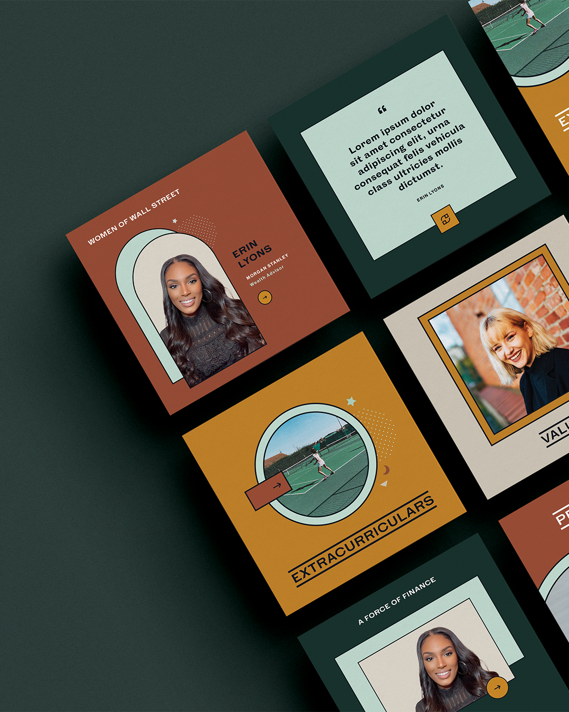
Bold Color
While our own brand palette has always remained neutral to reflect that we’re a blank canvas for each one of our projects, clients often tell us that they chose us due to our unique ability to communicate with color.
Every shade in a strategically-built brand is there for a purpose, unconsciously communicating your personality and values. Whether you’re disruptive and innovative, calming and gentle, or nostalgic and romantic, we’ll help you visually refine your message.

suited rebrand

Disobedient Women

Two Cranes

Master Music

Human Home
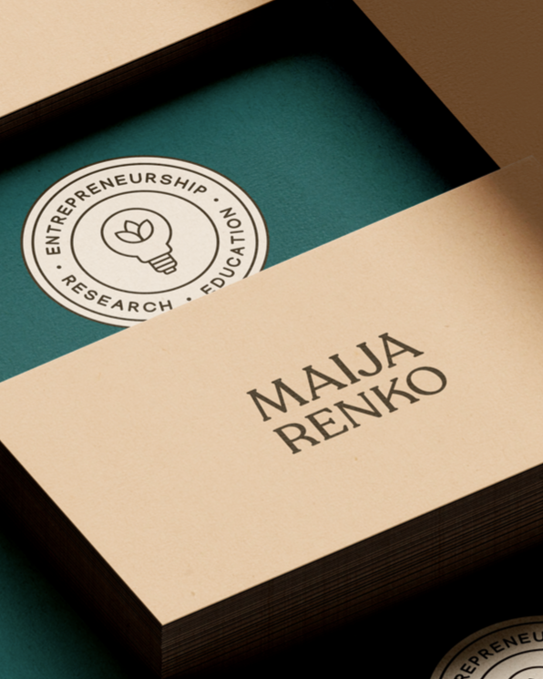
Maija Renko

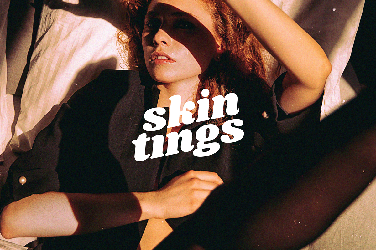
Skin Tings

Paste
opal branding
Branding through authenticity.